Lingo
brand design
experience design
ui design
A system built for story.
challenge
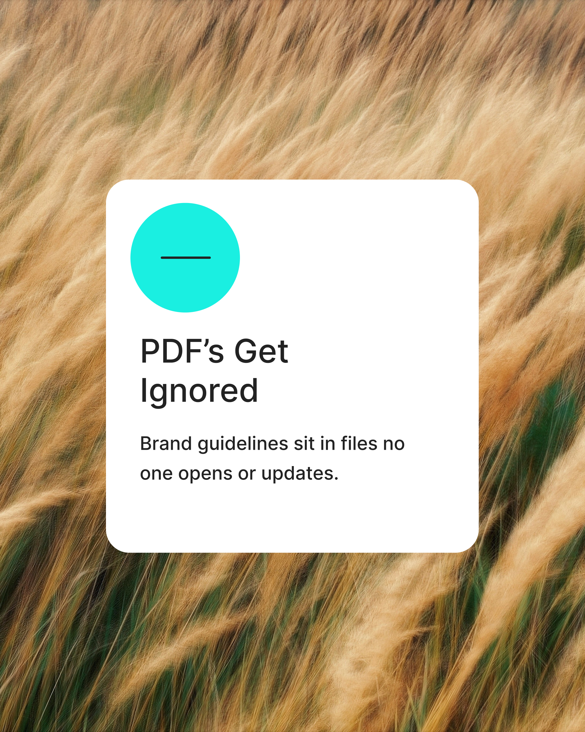
Lingo’s marketing site no longer reflected the product’s clarity or potential. The old visual system felt uniform and underplayed the product’s strength. The refresh needed to balance simplicity with warmth; giving the small internal team a site that was as intuitive to manage as it was to experience.
approach
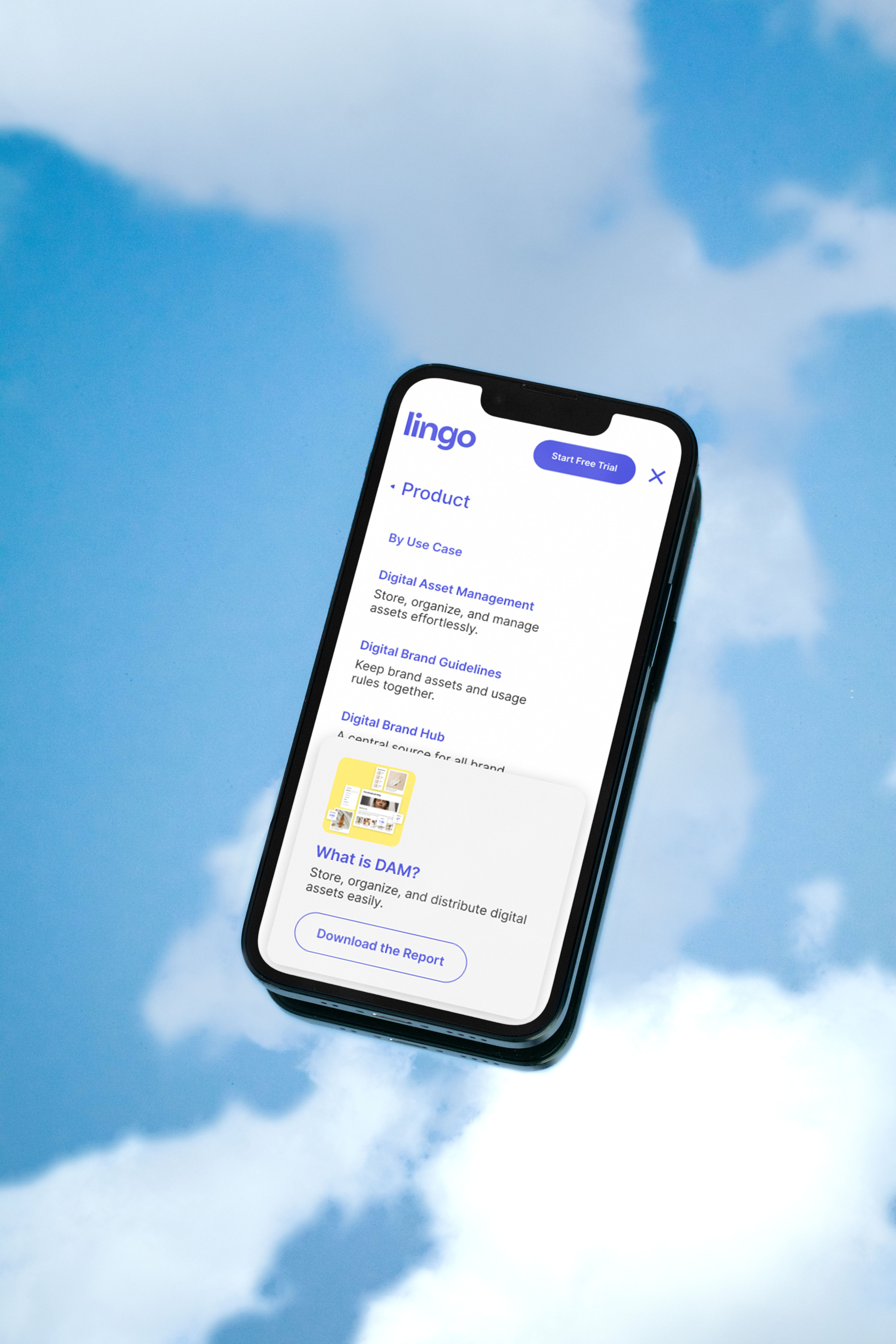
We modernized Lingo’s visual system and restructured the site around modular components that invited ease and exploration. The new design used white space, bold color, rich photography, and layering to create a system that feels both structured and expressive.
Outcomes
Modular Component Design System
Product Visual System
Color Palette & Typography
01
ModularComponents
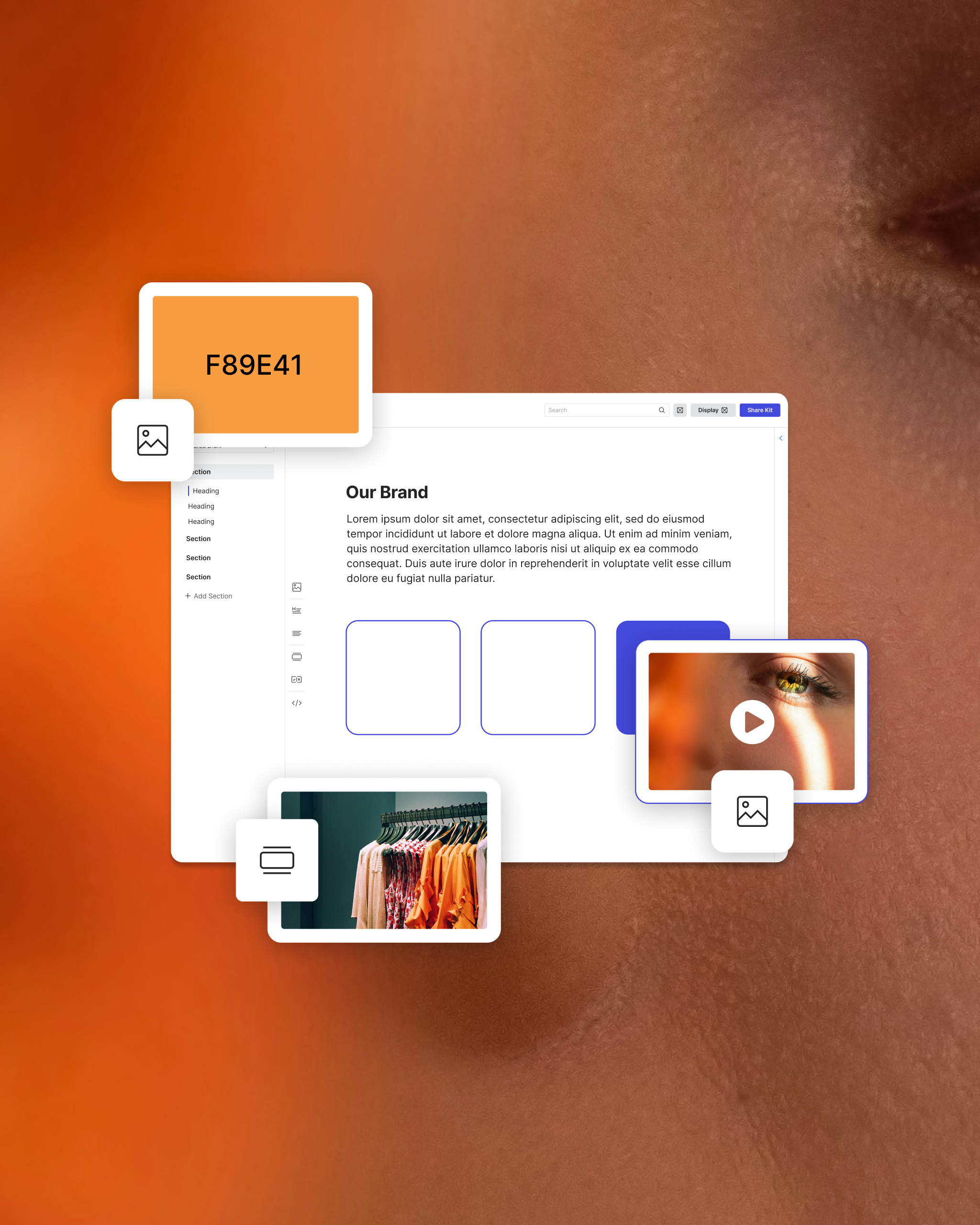
We designed a library of responsive, drag-and-drop modules—hero sections, feature highlights, testimonial blocks, and CTAs—so the team could build new pages in minutes. Each component carried a shared rhythm of spacing, typography, and motion, giving the system visual harmony no matter how it was assembled.
“Shiloh’s work was beautiful, well-organized, and deeply thoughtful. He managed to translate our goals into a clean, modern design that feels true to our brand and product.”
Edward Boatman
CEO, Lingo
02
Product Visual System
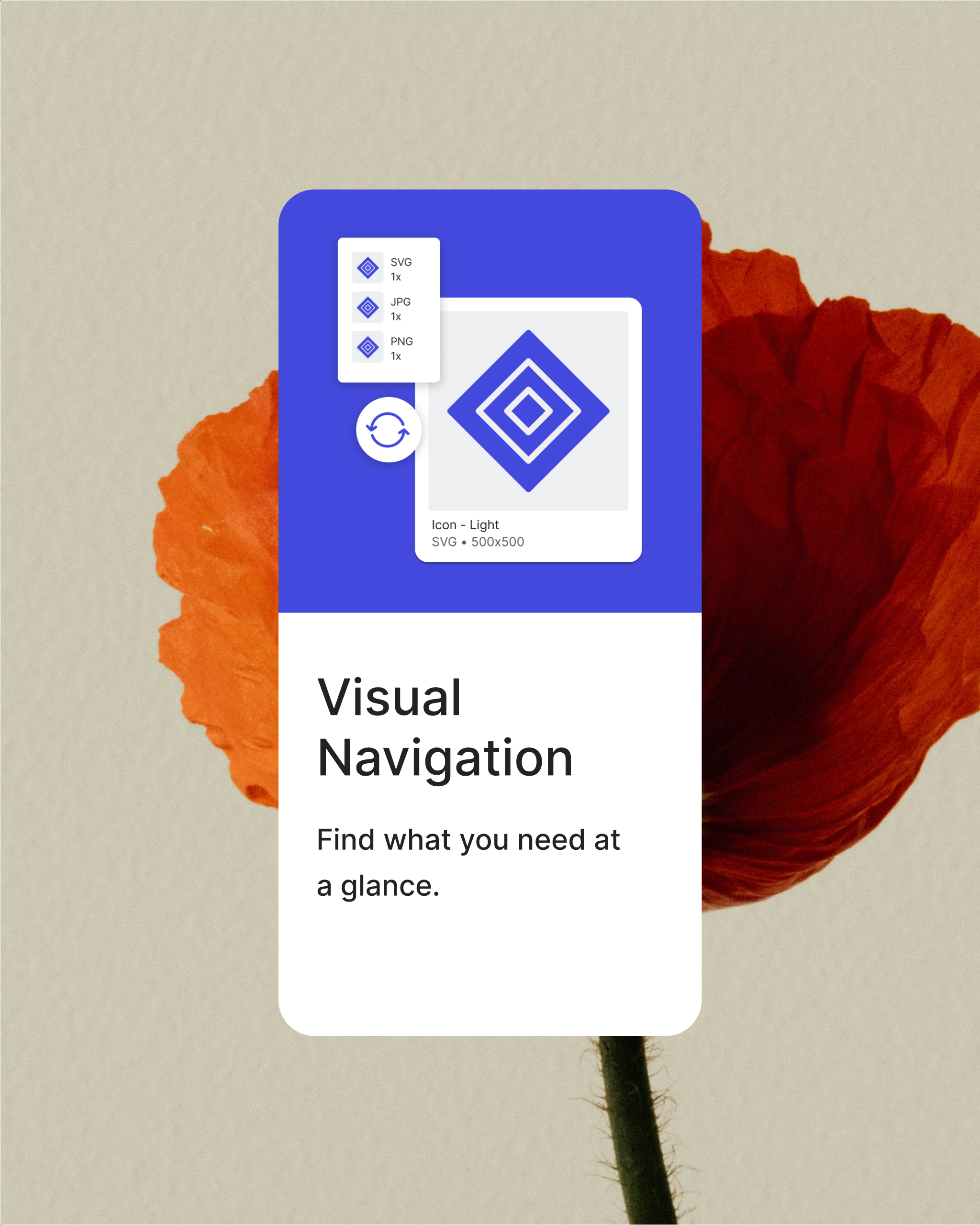
We created a visual storytelling layer that combined interface screens with fictional brand identities to demonstrate Lingo’s real-world versatility. Using Unsplash imagery and TheNounProject icons (Lingo’s sister company), we showed how the product supports any brand’s workflow.
03
Color Palette & Typography
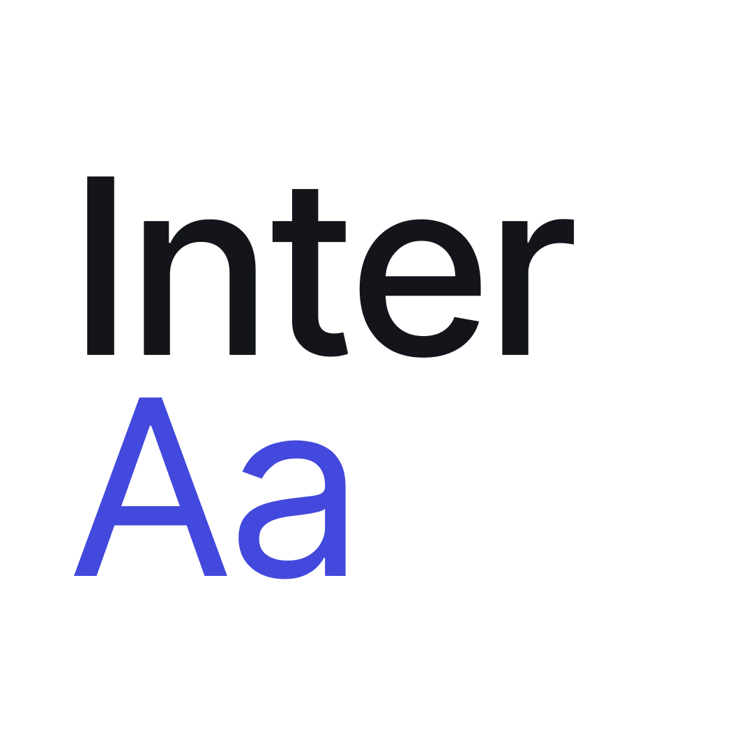
A shift from a singular blue palette to a dynamic range of supporting hues brought new life to the brand. Inter was chosen for its clean geometry, web safety, and clarity across weights.
credits
Principal Creative → Shiloh Gray, Grael
CEO → Edward Boatman, Lingo
Head of Marketing → Michelle Brammer, Lingo
CTO → Wes Byrne, Lingo
Imagery → Various, Unsplash
Iconography → Various, TheNounProject
Lingo
brand design
experience design
ui design
A system built for story.
challenge
Lingo’s marketing site no longer reflected the product’s clarity or potential. The old visual system felt uniform and underplayed the product’s strength. The refresh needed to balance simplicity with warmth; giving the small internal team a site that was as intuitive to manage as it was to experience.
approach
We modernized Lingo’s visual system and restructured the site around modular components that invited ease and exploration. The new design used white space, bold color, rich photography, and layering to create a system that feels both structured and expressive.
Outcomes
Modular Component Design System
Product Visual System
Color Palette & Typography
01
ModularComponents
We designed a library of responsive modules—hero sections, feature highlights, testimonial blocks, and CTAs—so the team could build new pages in minutes. Each component carried a shared rhythm of spacing, typography, and motion, giving the system visual harmony no matter how it was assembled.
“Shiloh’s work was beautiful, well-organized, and deeply thoughtful. He managed to translate our goals into a clean, modern design that feels true to our brand and product.”
Edward Boatman
CEO, Lingo
02
Product Visual System
We created a visual storytelling layer that combined interface screens with fictional brand identities to demonstrate Lingo’s real-world versatility. Using Unsplash imagery and TheNounProject icons (Lingo’s sister company), we showed how the product supports any brand’s workflow.
03
Color Palette & Typography
A shift from a singular blue palette to a dynamic range of supporting hues brought new life to the brand. Inter was chosen for its clean geometry, web safety, and clarity across weights.
credits
Principal Creative → Shiloh Gray, Grael
CEO → Edward Boatman, Lingo
Head of Marketing → Michelle Brammer, Lingo
CTO → Wes Byrne, Lingo
Imagery → Various, Unsplash
Iconography → Various, TheNounProject

